In web development you hear about accessibility (a11y) and how it's important, and at
D2L, we pride ourselves on
how accessible our platform is. Most of our platform is built on a couple of in-house frameworks which take care of a lot of "that stuff" for us. However, we've been moving towards, what we've dubbed, "Free-Range Apps", integrating semi-standalone web apps onto the page.
This grants us a lot of freedom, and the ability to do a lot more than we could before. Unfortunately, it means we have to do a lot more than we did before. All the fancy titles, summaries, form control groupings, etc. that you could take for granted are now something that we all have to be think about.
My team recently released such an app. We thought we'd followed "best practices", and would have something fairly easy to use from an accessibility standpoint. We had our resident a11y expert and tester,
Carin Headrick, take a crack at it. Boy we were wrong.
During our second or third testing session, I realized we needed to take a different approach, making it accessible from the ground up. Cue rewriting nearly all the HTML, and a fair bit of JavaScript.
To those using screen-readers, I apologize for the tables. I use Blogger to run this blog, and its editor uses tables to attach a caption to an image.
The App
Rubrics are a common way teachers assess students and their work. This is typically laid out as a grid, with some criteria to grade a student on, and several levels to choose from for each. This is something we've had in Brightspace for a while, but it's getting outdated and time for a refresh.
 |
| The old, dated, rubrics control |
Cue writing a new version as a free-range app.
We spent a lot of time thinking about how it should function, what it should look like, and if it would support everything from the old one. There was some thought about accessibility, but not much. The consensus was, "there's no way we can be worse than the legacy one. Whatever we do, it’ll be better." Technically this wound up being true, but it still wasn't pleasant to use without a mouse and a set of eyes.
Our original approach used CSS tables, admittedly because I wanted to play around with them. However, we started running into problems applying a colspan--CSS tables don’t support it--but thought it was tabular enough data that using HTML tables wouldn't be terrible. We used radio buttons to determine which levels were selected, thinking that would solve half of our a11y concerns.
After a while of developing it, and fighting with table cells' lack of actual height or width, we were ready to ship. Now it was time to think about a11y.
|
| The new rubric control when it shipped |
I installed
NVDA on my machine, read up on
how to navigate the page and tables, turned off my monitor, and gave it a try. Where we thought it couldn't be worse, we weren't wrong; we just weren't right, either. It was essentially impossible to use.
You could select a level, but it was difficult to tell which level was selected, or how many criteria, levels, or criteria groups there were. In analytic rubrics (your typical grid style) feedback spanning the entire row made column navigation impossible. In holistic rubrics (only one level for the whole rubric) having radio buttons spread across rows stopped screen-readers from knowing that they were linked, and it was very confusing otherwise.
Initial Attempts
At this point we decided to try fixing what we had. We knew a bit about aria-hidden for hiding things from screenreader, positioning things offscreen to hide them from visual users, aria-live to announce when things change, and tabindex to allow or prevent tabbing to elements. This was our toolbox. We would make this thing perfect.
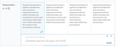
To start, I got rid of the radio buttons. Ironically they added more confusion than clarity.I instead added a tabindex to the table cells, which in combination with our on-click handlers, allowed you to tab through and select a level by hitting Enter. When it was selected, there would be a bit of offscreen text in the cell saying, "Level selected".
After trying this with the monitor turned off, you could select a level but there would be no feedback that anything happened, unless you tabbed to the next then back. I added a bit of text to the beginning of the row to announce "Level three selected" when you selected a level, using aria-live="polite" aria-atomic="true". Other than an atomicity issue with NVDA, detailed further down, it worked! This also solved the problem of wanting to know what level was selected, since you could find this when you first entered the row. Although it no longer announces, this text is one of the few things that still remain after the rewrite.
We found out that interactive elements should be able to be activated with the space bar. I used
ngAria to make the spacebar work for anything with
ng-click.
Now it was technically usable, but still not a good experience, and the feedback editor was still nigh-unusable.
We tried coming up with a couple of ways to partially redo what we had and make it work, but none of them panned out very well.
A Different Approach
During a further testing session I thought back to something our designer had come up with several months prior: field sets and radio buttons. A rubric doesn't have to be tabular. We'd convinced ourselves that it was, but only because that's how we've always seen them. In reality, it's just a list of criteria, each with its own levels, feedback, and points. The table-like layout is just a convenient way to visualize it.
With all of this in mind I decided to essentially start from scratch on our HTML, making it screenreader- and keyboard-friendly from the beginning, adding styling and a table-like appearance later. Fortunately we'd dropped support for IE9 about a month prior, opening up
CSS flex layout for us to use.

|
An early view at the "flat-form" approach.
A black background indicates aria-hidden, and a strike-through will be off-screen (ie: screen-reader only) |
I started by taking our directive templates and wiping their HTML. I added field sets, radio buttons, labels, legends, offscreen text, and more, purposefully making things ugly as sin. I copied some HTML from the originals to aid in keeping Angular functionality, but ultimately rewrote most of it. This had the advantage of being able to focus on a11y, and not about altering the controllers or logic.
After a little while it looked absolutely terrible, but it was quite usable. We had Carin give it a go, and she liked it! There were still a lot of work to do, but at least we were on the right track.
I took a bit of time to use CSS Flex layout to get a general rubric-like shape, and apply our existing CSS to make it look good. From here there was a lot of fine-tuning that went on, what we should do when the user performs an action, and how to actually do it.
The biggest problem to tackle now was to make the feedback editor usable.
Making it Accessible
It was a fair amount of work to get the best experience I could. There were some big easy wins, and a lot more smaller pieces that added a lot.
I've tried to detail the interesting parts here, and most of the points should be relevant for anyone doing similar.
Tools & Methodologies
 |
| NVDA Speech Viewer |
I tried
VoiceOver near the end of development, but didn't spend much time with it. I was physically unable to complete the tutorial without turning on the monitor, souring my opinion of it. I also gave
Window-Eyes a once-over.
When developing, I would focus on one or two things at a time, and try getting them right. I started with the easy things, then worked my way down to the nit-picky details. I'd typically have NVDA's speech viewer running to try things quickly. When testing, I would either turn off my monitor, or look away, and try using the rubric, paying attention to what didn't make sense, or where I'd get lost.
Overall Navigation
Making a page navigable to someone who can’t see it, or needs to access it with nothing but a keyboard, is extremely important. In the large ways, this is easy to do. In the subtler ways, it took some work, and on occasion, some sleight-of-hand to get right.
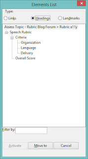 |
| Generated table of contents |
-
Used headers to create an easily navigable structure
-
Headers create an explicit page structure, which programs can use to generate a hierarchical Table of Contents
-
One of the quick wins, since it only took about five minutes to do
-
The rubric name, criteria group & overall score names, and criterion names are all header elements
-
Wrapped each criteria in a fieldset, with a legend for the title
-
Groups and creates an inherent context for the form elements
-
Screen-readers that provide form field navigation will use the legend as part of the name of the elements
-
eg: instead of just, “Level four Eight points Radio button”, it would be, “Thesis Level Four Eight points Radio button”
-
Put the h4 in the legend and hid it offscreen, while repeating the text inside the first “cell”
-
Couldn’t use the title in the legend and get the desired visual layout
-
Used aria-hidden=”true” to hide the second title so it isn’t repetitive text being read
-
Shows the same thing to both visual and screen-reader users, aiding conversations about the page
-
Put summary text at the top of major sections, immediately following the header
-
Provides a brief description of, and information about the upcoming content
-
Included one for each rubric, criteria group, and overall score
-
Tab order, and tab focus, were extremely important for both sighted and non-sighted users
-
Both types of users may want--or need--to navigate the rubric using the tab key
-
Only relevant and interactive components should be focusable
-
Use tabindex=”0” to make something be tabbable, and tabindex=”-1” to prevent it from being tabbed, and/or allow focus via JavaScript
-
Tab order should be logical, and ideally follow the visual layout so the focus doesn’t appear to bounce around the page
-
Had to pull some tricks to have one element appear to be focused when another actually had focus
-
Hid visual column headers, and repeated the relevant information in the criterion-level cells as offscreen text
-
Unlike HTML tables, the table “headers” in Flexbox don’t associate with the “cells” to provide contextual information
-
The visual headers are hidden from screen readers as their place in the semantic ordering would just be confusing
Level Selection
Level selection returned to having radio buttons inside labels, but with some improvements.
-
As mentioned earlier, each criterion is contained in a fieldset
-
Radio buttons are further contained in a labelled radiogroup
-
Surrounded with <div role=”radiogroup” aria-label=”[Criterion Name]”>
-
Helps separate them from the other elements in the criterion
-
Semantically joins the radio buttons as a single set
-
Radio buttons provided free level-switching functionality, and all the semantics that go along with them
-
Criterion-level radio buttons are wrapped a label
-
Labels provide a lot of functionality for both sighted and non-sighted users, and are an essential part of building a form
-
Provide a larger area to click on to select the form control
-
Gives a name and/or description to the control, particularly for screen-readers
-
The entire criterion-level is a label, with text and radio button inside
-
Allows the user to click anywhere in the cell to select the level, without JavaScript
-
The level name, points, and description are associated directly with the radio button
-
Used aria-labelledby=”...”, referencing the title & points, to avoid reading the description repeatedly
-
Screen-readers usually state that something is a radio button, and its selection & placement information after reading the entire label
-
Using an ARIA label provides a lot of advantages
-
When switching levels, only the level and points are read out, before radio button information
-
Avoids silencing the reader before getting to relevant radio button info
-
The description is still easily found, and some readers will read it when first navigating to the radio button
-
Plays nicely in NVDA, JAWS, Window-Eyes, and probably others, but has some issues in VoiceOver
-
The currently-selected level is stated right after the criterion name
-
Faked focus visually on the parent label when radio button is focused
-
One of the very basic accessibility requirements is to have a visual indicator of focus
-
The element that gains focus is the radio button, but it’s hidden offscreen, so the label needed to appear focused
-
Used Angular’s ng-focus and ng-blur to toggle a .is-focused class on the label
 |
| Faked visual focus on criterion-level radio button |
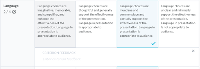
Editing Feedback In Place
This was, by far, the hardest part to get right. If you’re looking to create an accessible edit-in-place control, this should be helpful.
 |
| Editing feedback for a criterion |
Visually it’s easy to see what’s happening: Hover and it indicates that you can click; click and it gains a border and the usual text-entry cursor appears. When you click “Done”, or anywhere else on the page, it goes away. Reading the feedback is easy since it’s always on the page.
This is a lot of information to portray to someone who can’t see it.
-
Included the title and basic instructions for editing in the control with the feedback text
-
Will be read out when the user navigates or tabs to the edit-in-place control
-
The title and instructions are simply, “Criterion Feedback Activate to edit.“
-
Labels the element in form control navigation
-
Marked the control as a button using role=”button” tabindex=”0”
-
Informs a screen-reader that it should be treated as a button, with all the semantics that go with it
-
Adds it to the list of form controls on the page
-
Adding the “button” role causes ngAria to add a space-bar handler
-
Fakes focus on the surrounding feedback cell when focusing on the button
-
-
aria-live is used to announce when something changes
-
Different screen-readers read announcements at different times, and may treat aria-live=”assertive” the same as aria-live=”polite”
-
Using “assertive” some readers would cut off reading the current element
-
Using “polite” the reader will wait until the current element is fully read before announcing anything. This is an issue if it’s a couple of paragraphs of text
-
Users will often stop the screen-reader from reading if it’s being noisy, leading to missed announcements
-
-
Added aria-label=”...” to the edit-mode wrapper to state that you’re editing, and how to escape
-
The label will be read out immediately, before the feedback text, guaranteeing that the user is aware of the state change and knows how to get out of it
-
The text is, “Editing feedback. Use Tab key to finish.”
-
Unlike adding text to the editor itself, this won’t be read out repeatedly
-
Assigned ARIA roles to mark the editor as a multiline text field
-
Set role=”textbox” aria-multiline=”true” on the div that TinyMCE uses as its editor
-
Tells the screen-reader to enter edit mode, and inform the user that they’re in a multi-line editor
-
Unfortunately it isn’t in the forms control list until the user activates the editor, as it doesn’t exist on the page until then
-
Captured Tab with keyup to escape the editor
-
Provides the user with a means of closing the editor without needing to actually click elsewhere
-
Capturing and preventing the default action of the Tab key stops the browser from shifting focus, and partially reading an element, before manually controlling it
-
Manually moved the user’s focus, when appropriate, to provide the best experience
-
Used TinyMCE to focus in the editor after content was loaded
-
We already did this for sighted users to immediately begin editing
-
Makes a screen-reader user immediately aware that there’s an editor, and puts them inside without needing to search for it
-
Focus needs to be moved somewhere when escaping using the Tab key
-
Don’t move the focus if the editor was closed via blur event, as the user likely purposefully shifted their focus elsewhere
-
Created a temporary offscreen element to shift focus to when leaving the editor
-
Reads out the text in this element to state, “Done editing”, without worrying about aria-live behaviour
-
Lessens potential confusion for sighted users that would occur if the focus were shifted back to the editor button
-
Positioned it inside the editor wrapper, but between levels and feedback so the user could quickly tab forward or backwards and not lose their place
-
-
Not strictly related to making the app more accessible, but it solved some other issues anyway
-
Typing would frequently lag, and screen-readers wouldn’t be able to read words or letters as they were typed
-
Used most of the same code, but changed to initializing TinyMCE and handling dirtying of contents ourselves
Other Ways to Work on Feedback
Aside from simply editing, there are a few things you can do with the feedback:
-
Removing (clearing) feedback for a criterion
-
Restoring feedback to the default, predefined, feedback for the selected level after you’ve editing it
-
Adding feedback to a criterion that doesn’t have any, either because no level was selected, the level doesn’t have any predefined feedback, or the feedback was cleared
-
Restoring your custom feedback if you cleared the feedback, or restored the level’s predefined feedback
 |
| Feedback and its buttons in various states |
Since this is very particular to our app, I’ll just detail what I did for these four cases. That said, some of it may still be relevant to something you’re working on.
A couple of these buttons was another place where focus had to be faked. If focus followed the DOM order the visual forced on us, it would be:
-
Criterion score
-
“Add Feedback” & “Restore Custom Feedback” buttons
-
Criterion levels
-
Feedback edit-in-place
-
“Restore Predefined Feedback” & “Clear Feedback” buttons
I didn’t want the feedback altering buttons being so far removed from feedback, so the desired order was:
-
Criterion score
-
Criterion levels
-
“Add Feedback” & “Restore Custom Feedback” buttons
-
Feedback edit-in-place
-
“Restore Predefined Feedback” & “Clear Feedback” buttons
After some discussions with co-workers, and an ongoing in-joke of a line between “Great” and “Terrible”, it was solved thusly:
-
Include the buttons in the same parent as the title and score, but have them have aria-hidden=”true” tabindex=”-1”
-
Include a second set of offscreen, focusable, buttons, that also perform the same actions
-
Toggle a .is-focused on the visual buttons when the hidden ones are focused or blurred
It’s not great, but it’s not terrible, and it solved the problem.

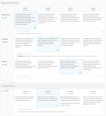
|
| An analytic rubric after being completely redone
|

|
The same rubric with CSS removed.
Grey text is offscreen, strike-through is aria-hidden |
Problems Encountered
Anything you do in web development is going to have cross-system compatibility issues that have to be worked around. Screen-readers are no different.
NVDA wouldn’t automatically enter edit mode when focusing in the editor
When clicking the edit-in-place button, the editor would be activated, focus moved to the end of the text, and the screen-reader was supposed to enter edit mode. NVDA would start editing if clicking the “Add Feedback” button, but not the edit-in-place control, whereas JAWS would. You had to hit Space or Enter to enter edit mode.
Cause: The editor is a child of the button the user was focused on
Solution: Added a dummy element, with aria-hidden=”true” tabindex=”-1”, to move focus to before activating the editor, then focus moves into the editor
JAWS reading nothing but “JS App Loader button”
Sometimes when editing feedback any moving around the page would start saying the page title, “JS App Loader Button”, and nothing else. Any tabbing, arrow navigation, etc. would have the same thing read out.
Cause: Destroying the currently-focused element, without moving focus elsewhere
Solution: Attempt to move focus before destroying the element the user is focused on
NVDA not reading the next element’s text when tabbing from the “Done Editing” field
After editing the feedback and tabbing out, the user’s focus is moved to a “Done Editing” element. When the user tabs away from this it gets removed from the page, but nothing would be read out until they continue tabbing.
Cause: Removing the focused element as soon as it’s blurred
Solution: Have a slight timeout (eg: 10ms) after blurring before removing the element
JAWS not reading announcements, and NVDA trampling wanted text when announcing
After performing a feedback action, focus would be moved and an ARIA Live announcement would be read out to inform the user what just happened. JAWS would frequently not read the announcement at all, and NVDA would stop reading the newly focused element’s text with the announcement, making the user not know where they landed.
Cause: Timing conflicts, and unexpected behaviour of aria-life=”assertive”
Solution: Only use aria-live=”polite”, enforce timing of actions so that focus change occurs, then after a delay (25ms) the aria-live text is changed. This gets the screen-reader to start reading the new focus text, then see the announcement, which it will read out after it’s done reading the element
NVDA and partial/atomic announcements
When using aria-live you can optionally use aria-atomic=”true|false”. True will cause the entire text to be read out, false (the default) will only be the changed text. NVDA was reading out weird parts of the changes when non-atomic (eg: “Proficient” to “Partially Proficient” was read as “artially P”). When atmoic, it would occasionally read the whole text four times.
Cause: Parts of the text changing, rather than the entire text changing at once
Solution: Used a directive to emulate atomic changes that clears the text, then adds the new text a moment later. This directive made announcements in general much easier later on.
Tips & Tricks
-
Pay attention to focus
-
Where is it? Where should it be? Does it make sense?
-
Does the order make sense?
-
Should what you’re focusing on really be able to receive focus?
-
Is everything that should be focusable, focusable?
-
When removing an element, always make sure focus is moved elsewhere
-
Know the difference between DOM, Semantic, and Visual order
-
Have appropriate labels & descriptions
-
Include descriptions/summaries for non-sighted users that describe complicated elements
-
Use title, aria-label, aria-labelledby, aria-describedby, <label>, <legend>, or other appropriate tags & attributes to provide further or alternate text for items on the page
-
Be succinct in your messages and details
-
The longer the text being read out, the quicker your user will get bored and tell their screen reader to shut up
-
The more time someone has to spend listening to what you wrote, the less time they’ll have to get work done
-
Use native HTML elements whenever possible (eg: use a real radio button)
-
-
Much better, more accurate, and more thorough reference than that other site that makes you think they’re with the W3C
-
When googling anything, use “MDN {what you’re looking for}”
-
-
Make your page accessible from the beginning
Conclusion
There’s a lot you can do to make your page accessible, both to mouse, keyboard-only, screen-reader users, and more. The
W3C’s WAI-ARIA specifications detail a lot of what you should do, and they’ve release a nice
WAI-ARIA Authoring Practices guide to help you out. I suggest anyone who’s looking to do web development at least skim the specs and practices, as you’ll learn a lot.
The biggest things I learned from all of this is to consider accessibility as part of your basic design. Don’t leave it until the end of your project and hope it’ll just work. It may not be easy, or even possible, to make a perfect experience, but it’s worthwhile. While some changes may only benefit a small subset of your users, others will benefit all your users.
If you have any questions or corrections, please leave a comment and I’ll try to address them.


